
Artist signature examples can help you decide whether to sign your work with your full name, surname, initials, a monogram, or a simple personal mark. The best signature is not necessarily the most decorative. It is one you can repeat naturally, connect clearly to your name, and place on a painting, drawing, print, or digital piece without competing with the artwork.
I would start with the simplest versions of your own name before trying to invent something elaborate. A signature usually becomes recognizable because you use it consistently across a body of work, not because it looks complicated on its own.
Below are practical artist signature ideas you can adapt, followed by examples from Picasso, Salvador Dalí, Vincent van Gogh, Claude Monet, and Leonardo da Vinci. After that, I walk through how to develop your own signature and use it on different kinds of artwork.
If you are here because you found an unknown signature on an existing painting, that is a different problem. Use my guide to identifying an artist signature instead. A signature can provide an important clue, but it cannot authenticate an artwork by itself.
5 Artist Signature Ideas to Try
Most artist signatures can be reduced to a few basic formats. I would test all five before deciding which one feels natural on your actual artwork.
| Signature style | Best when | Main drawback |
|---|---|---|
| Full name | You want clear identification | Can become too large on small work |
| Surname | You want a compact but readable signature | A common surname may be difficult to trace |
| Initials | Your artwork is small or visually minimal | May not identify you to an unfamiliar viewer |
| Monogram | Your initials combine naturally into one simple mark | Can become too complicated or logo-like |
| Symbol | A personal mark genuinely relates to your identity or work | May have no obvious connection to your name |
1. Full-Name Signature
Your full name is the clearest option because anyone looking at the work has a direct clue to the artist’s identity.
Start by writing your name normally. Try cursive, printed letters, and a combination of both before deliberately stylizing it.
If your full name feels too long at the size you need, simplify it rather than squeezing the letters together until the signature becomes unreadable.
2. Surname Signature
Using only your last name can be a good balance between readability and size.
It is particularly practical for painters, illustrators, and drawing artists who want a recognizable handwritten mark that can fit into a relatively small area.
If your surname is common, I would still put your complete name and artwork information on the back of the piece.
3. Initials
Initials work well on small drawings, studies, plein-air paintings, sketchbook work, and minimal compositions where a complete name might feel too heavy.
The disadvantage is identification. A pair of initials may look elegant but give a future collector very little information about who created the work.
If you use initials on the front, put your full name, title, date, medium, and other identifying information on the back.
4. Monogram
A monogram combines two or more initials into one compact mark.
This can work particularly well when the shapes of your initials naturally overlap, stack, or interlock.
I would keep the design simple enough to draw in a few seconds. If you need to construct the monogram carefully every time, it will be frustrating to reproduce on textured canvas, soft paper, or a finished drawing you do not want to damage.
5. Symbol or Personal Mark
A small symbol can work when it has a real connection to your name, identity, or artistic practice.
The drawback is that an unfamiliar viewer may have no way to connect that symbol to you.
If you choose a symbol, I would still use your written name on the back of the artwork, on your website, and in your inventory records.
I would also avoid deliberately imitating another artist’s recognizable mark. Your signature should help identify your work rather than make it resemble someone else’s.
Famous Artist Signature Examples
Famous artist signatures are useful to study because they demonstrate how different a successful mark can look.
Some are readable names. Others are loose, abbreviated, or highly stylized. What matters is not copying the lettering but noticing the rhythm, scale, simplicity, and relationship between the signature and the artwork.
Pablo Picasso

Picasso’s surname creates a strong, fluid shape without requiring complicated lettering. The underline adds a distinctive finish, but the signature is still fundamentally his handwritten name.
The useful lesson is that ordinary handwriting can become recognizable through repetition and rhythm. You do not necessarily need to transform your name into a logo.
Salvador Dalí
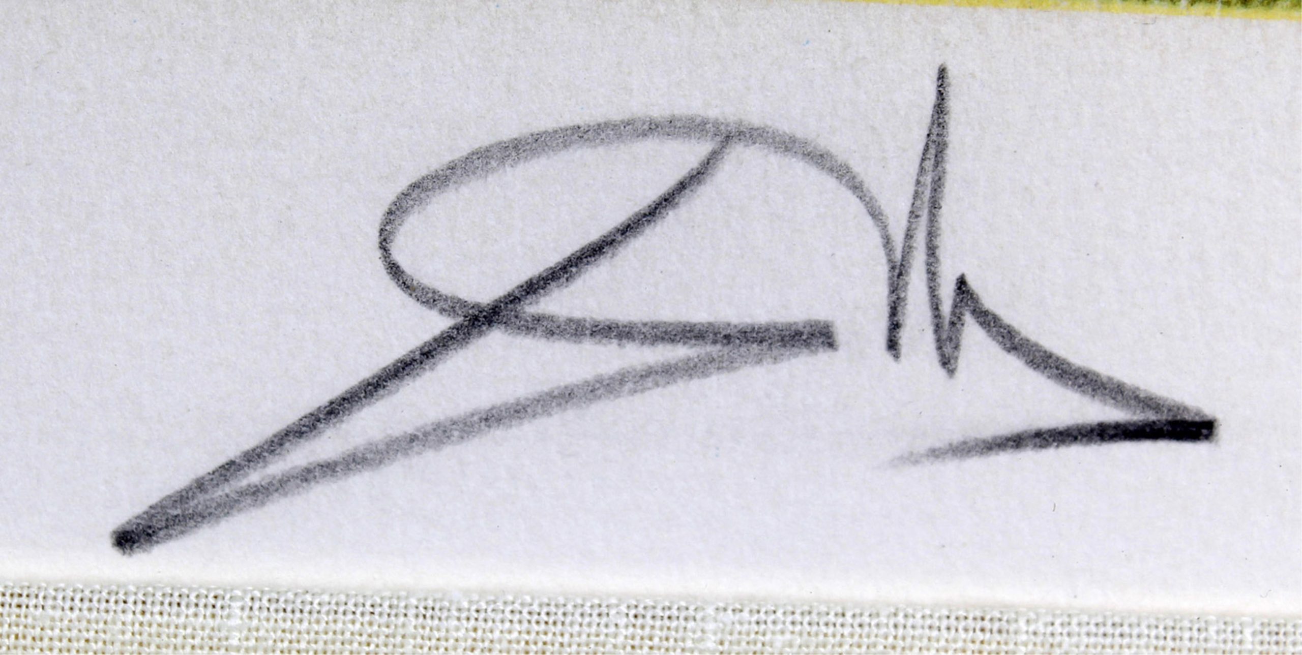
Dalí’s signature is far more theatrical. The long movements and flourishes give it an expressive quality that fits the public identity surrounding his work.
I would not copy the drama of the mark. What is useful is the way the signature feels related to the personality of the artist rather than looking like an unrelated label added afterward.
Vincent van Gogh

Van Gogh frequently used his first name, “Vincent,” rather than an elaborate full-name signature.
It is a useful example because it breaks the assumption that an artist signature has to be cursive, formal, or based on a surname.
Claude Monet

Monet’s cursive surname is readable and relatively restrained.
It shows how a signature can remain identifiable without becoming one of the strongest visual elements in the painting.
Leonardo da Vinci

Leonardo’s surviving written forms vary, but this example shows a controlled handwritten approach rather than a separate decorative emblem.
More Famous Artist Signatures to Study
| Artist | Signature approach | What to notice |
|---|---|---|
| Henri Matisse | Rhythmic handwritten surname | Simple handwriting can still have strong movement. |
| Albrecht Dürer | Interlocking AD monogram | Initials can become a compact recognizable shape. |
| Rembrandt | Different written forms during his career | A signature can evolve as an artist’s identity develops. |
| Frida Kahlo | Readable written name | A direct name can be personal without being ornate. |
| Georgia O’Keeffe | Understated written name | A restrained signature can still feel confident. |
| Jean-Michel Basquiat | Name, text and graphic symbols | A mark can share the graphic language of the artwork. |
| Andy Warhol | Handwritten name | Recognition often comes from repetition rather than ornament. |
| Keith Haring | Fast written or drawn mark | The movement of the signature can relate to the movement of the art. |
There is no single “artist-looking” signature shared by famous artists. That is the useful lesson.
A recognizable signature usually becomes recognizable because it is attached consistently to a recognizable body of work.
How to Make an Artist Signature
I would develop a signature on ordinary paper first, then test it on the materials you actually use.
1. Decide What You Want the Signature to Do
A practical artist signature should do three things:
- help identify the artist
- remain easy to repeat
- avoid disrupting the artwork
If an idea fails one of those tests, I would simplify it before worrying about whether it looks distinctive enough.
2. Write Your Name at Least 10 Ways
Start with normal handwriting rather than trying to manufacture an artistic signature immediately.
Try:
- your complete name
- your surname
- first and last initials
- initial plus surname
- printed letters
- cursive letters
- a simple monogram
Change the spacing, slant, size, and connections between letters. At this stage I would avoid adding random loops and flourishes simply because signatures are supposed to look sophisticated.
3. Reduce the Options to Three
Choose the three that feel easiest to make naturally.
If one signature looks beautiful but you have to draw it slowly instead of writing it, I would probably eliminate it.
4. Test the Signature on Actual Artwork
This is where many signature ideas fail.
A large elegant signature may look good by itself on white paper but feel completely wrong in the corner of a small drawing.
Use old studies, rejected artwork, scraps of the same material, photocopies, or digital mockups to test each option.
- Can you recognize it at the size you will actually use?
- Does it compete with the focal point?
- Does it feel related to the marks in the artwork?
- Will a mat or frame cover it?
- Does it remain visible when the artwork is photographed?
5. Make It Smaller Than You Think
I would rather have someone notice the artwork first and discover the signature second.
If the signature becomes one of the first things you see from across the room, reduce the size, lower the contrast, or move it to a quieter part of the composition.
6. Practice the Final Version
Once you choose a version, repeat it until the movement feels natural.
You do not need every signature to be mechanically identical. Handwriting naturally varies. The overall shape and identifying features should simply remain recognizable.
Cursive, Print, Initials or Monogram?
None is inherently more professional.
Cursive tends to create a faster and more fluid mark. Printed letters are often easier to read and may suit graphic, minimal, or tightly controlled work.
You can also combine them. A cursive initial beside a printed surname may feel more natural than forcing your entire name into one style.
The deciding question is whether the signature still works when made at the size and with the tool you actually use.
Where Should an Artist Sign a Painting?
The lower-right corner is traditional, but I would not treat it as a rule.
The signature becomes one more visual shape in the composition. Put it where it causes the least disruption.
- Lower right: Familiar and easy to find when there is enough open space.
- Lower left: Useful when the right side contains an important shape or focal detail.
- Along an edge: Visually quiet, but leave room for matting, framing, stretching, and cropping.
- Within the image: Can work when the signature sits naturally within an open value or texture without disguising itself as part of the subject.
- On the back: An option when you want the front completely uninterrupted.
I usually think about placement after the artwork is finished rather than deciding that every signature must occupy the same corner.
How Big Should an Artist Signature Be?
Smaller is usually safer.
The signature should be easy to find when someone looks for it without overpowering the focal elements of the work.
Contrast matters as much as physical size. A tiny black signature can dominate a pale graphite drawing, while a slightly larger gray signature may sit quietly within it.
Photograph the piece after signing it. A signature that looks restrained in person can become surprisingly noticeable in a small portfolio image or online shop listing.
How to Sign Drawings
For drawings on paper, I generally like the signature to feel physically related to the drawing itself.
A graphite drawing can be signed in graphite. A ballpoint drawing can be signed with the same pen. An ink drawing can use the same or a compatible ink.
Keep the pressure controlled so you do not dent or damage the paper.
If you introduce another material, test it first for bleeding, feathering, smudging, and discoloration.
For graphite work in particular, also think about how the finished surface will be handled. My guide to preserving pencil drawings covers smudging and storage in more detail.
How to Sign Paintings
On a painting, using a fine brush and paint compatible with the work usually helps the signature feel integrated rather than added on top.
I would normally choose a color already present in the painting or mix a slightly lighter or darker variation of the surrounding value.
A pure black, white, or bright red signature can suddenly become the strongest contrast in the picture if that color appears nowhere else.
If the painting has heavy texture, practice the signature on another textured surface first. A mark that is easy to paint on smooth paper may skip or widen across raised paint.
How to Sign Art Prints
Limited-edition prints are often signed in pencil in the margin beneath the image.
A common arrangement places the edition number toward the left, the title near the center, and the artist’s signature toward the right, although practices vary.
Whatever system you use, keep it consistent throughout the edition.
For open-edition reproductions, decide whether the artwork itself contains a reproduced signature, whether each print receives an additional hand signature, or whether you use another system.
Describe the print accurately when selling it so the buyer understands what has been individually signed.
How to Sign Digital Art
A digital signature can be drawn directly with a stylus or created from a scan of your handwritten signature.
I would keep a high-resolution master version and scale copies for individual pieces rather than redrawing the mark differently each time.
A signature and a watermark are not necessarily the same thing.
The signature identifies the artist and can be part of the finished presentation. A watermark is usually designed to discourage unauthorized online use and may therefore be much more visible.
Should You Put the Date Beside Your Signature?
You can, but you do not have to place the date on the front.
On small or visually quiet artwork, a signature plus a date can begin to create unnecessary clutter.
A simple alternative is:
- signature on the front
- full name on the back
- artwork title
- year completed
- medium
- dimensions
If the artwork cannot safely be written on, put that information on an attached label or accompanying document. My guide to artwork description cards shows another way to keep those details with the work.
Can You Change Your Artist Signature?
Yes.
An artist’s signature can evolve just as the artwork does.
I would not change it every few months simply because another design looks interesting, but you do not need to treat the first version you invent as permanent.
If you change it substantially, keep dated examples of the earlier and later versions in your records.
Also keep your full written name consistent across your website, inventory, receipts, labels, certificates, and other documentation. My artist resources collect many of those professional materials in one place.
Common Artist Signature Mistakes
- Making it too decorative: Your artwork already demonstrates your creativity. The signature does not need to become a separate performance.
- Making it impossible to connect to your name: A completely unreadable mark may look interesting but can create identification problems later.
- Signing too large: The signature should not become the focal point.
- Using too much contrast: A small dark signature can still overpower a delicate drawing.
- Signing too close to the edge: Leave enough room for framing, matting, cropping, or stretching.
- Using an untested material: A marker or pen may bleed, fade, crack, or react differently from the artwork underneath it.
- Choosing something difficult to repeat: If it takes several attempts to make correctly, simplify it.
- Treating the signature like a corporate logo: It can be recognizable without looking mechanically stamped onto every artwork.
Your Signature Helps Identify the Work, but It Does Not Authenticate It by Itself
A familiar-looking signature is not proof that an artwork is genuine.
Signatures can be copied, added later, damaged, misread, or changed during an artist’s lifetime. Researchers may also look at provenance, labels, materials, technique, subject, inscriptions, ownership history, and other evidence.
If you are researching someone else’s artwork rather than designing your own mark, use my guide to how to identify an artist signature.
The Smithsonian American Art Museum also has a useful resource on artist signatures, monograms, and markings.
A Simple Formula for Your Own Artist Signature
If you are stuck, I would make the decision much simpler.
Start with your surname or initials. Write it naturally. Remove anything difficult to repeat. Make it smaller than the important visual elements in the artwork. Use a material compatible with the piece. Put the complete identifying information on the back.
Then use it.
A signature usually becomes yours through repetition. The goal is not to invent the most impressive signature in the world. It is to create a mark that feels natural, remains recognizable, and belongs visually to the artwork you are signing.
If you are preparing work to sell or exhibit, continue with my guides to certificates of authenticity, artwork description cards, and the rest of my artist resources.